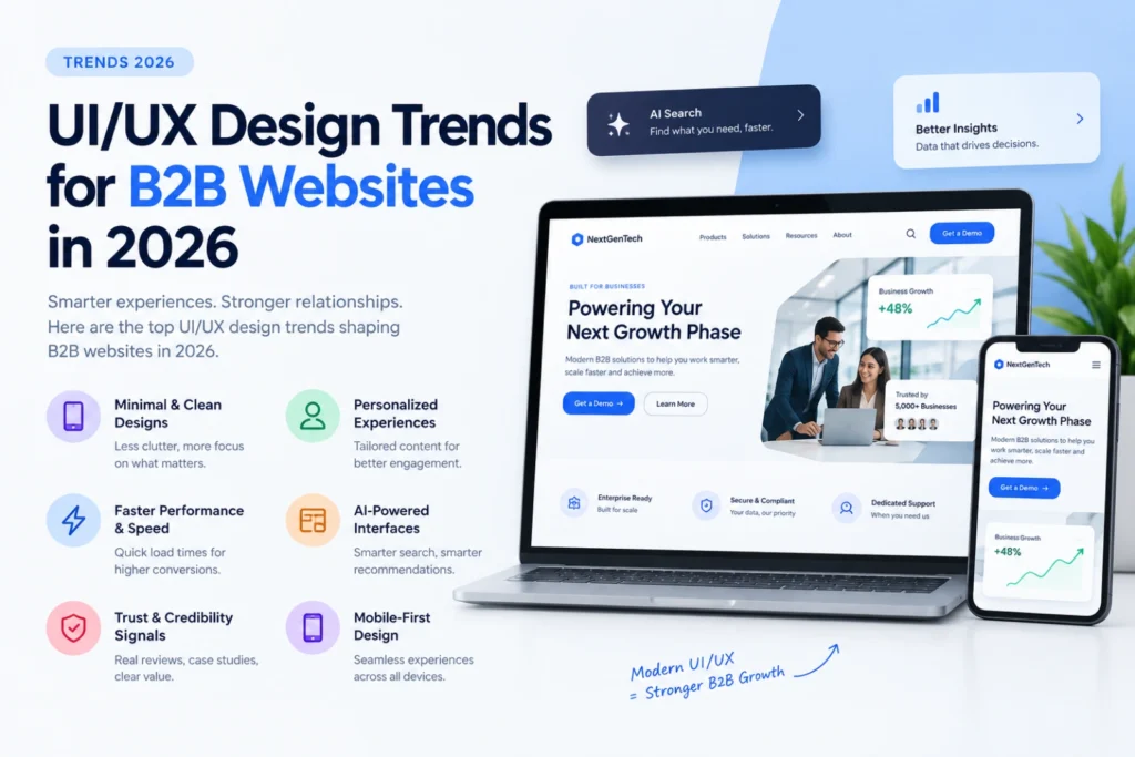
Quick answer: For B2B websites specifically, the design trends worth adopting in 2026 are: clearer, faster-loading layouts over heavy animation, AI-readable content structure built into the design (not bolted on after), accessible design as a baseline rather than an afterthought, and dark-mode support. Trends worth skipping for most B2B sites: excessive parallax scrolling, auto-playing video backgrounds, and overly abstract illustration-heavy homepages that delay getting to the actual offer.
Trends worth adopting
Clarity over decoration. B2B buyers are usually time-pressed and comparing multiple vendors. A homepage that gets to “what you do, who it’s for, and what to do next” within the first screen consistently outperforms a heavily animated, slow-loading alternative — for both conversion and page speed scoring.
Design that supports AEO from the ground up. Layouts built with clear heading hierarchy, scannable sections, and room for direct-answer text near the top of key pages perform better in both human readability and AI-search extraction. This needs to be a design decision, not something patched in after the fact.
Accessible design as standard, not an add-on. Sufficient color contrast, readable font sizing, and keyboard-navigable interactive elements are increasingly expected baseline quality, not a specialized feature request.
Dark mode support. Increasingly expected by users who browse in dark mode system-wide, especially technical and IT-sector B2B audiences.
Genuine, specific imagery over generic stock photos. Real product screenshots, real team photos, and real client logos build more trust than polished but obviously generic stock imagery — B2B buyers are good at spotting the difference.
Trends worth skipping for most B2B sites
Heavy parallax scrolling.** Looks impressive in a portfolio piece, but often hurts load time and can create usability issues, especially on mobile.
Auto-playing video backgrounds. Slows page load, often gets muted or blocked by users anyway, and rarely earns its cost in actual engagement for a B2B audience trying to quickly evaluate a vendor.
Abstract illustration-only homepages. If a visitor can’t tell what your business does within a few seconds of landing, an aesthetically striking design is actively working against conversion.
The B2B-specific design principle that matters most
Consumer websites can prioritize emotional storytelling and exploration. B2B buyers are usually task-oriented — they arrived to answer a specific question (can this vendor do X, what does it cost, who else uses them) and want to answer it quickly. Every design decision should be evaluated against whether it helps or slows down that specific task.
FAQ
Do I need to redesign my site every time a new trend appears?
No — chasing every trend usually costs more than it’s worth. Adopt trends that genuinely improve clarity, speed, or accessibility; skip ones that are primarily decorative.
Does a more “designed” homepage always convert better for B2B?
Not necessarily — clarity and speed usually outperform visual complexity for B2B audiences specifically, unlike some consumer or lifestyle brand contexts.
How do I know if my current design is hurting conversions?
Check basic analytics for bounce rate on your homepage and top landing pages — a high bounce rate combined with slow load time or unclear messaging is a strong signal design is a factor.